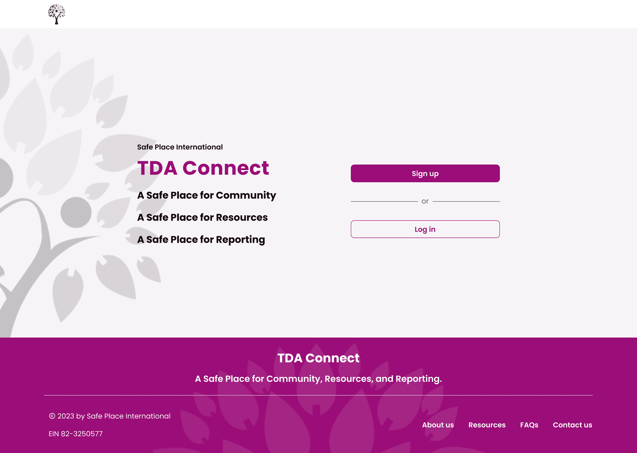
TDA CONNECT
Project Brief | The objective of this project was to optimize the user experience of TDA Connect, a digital platform dedicated to empowering The Dream Academy graduates by providing a safe and secure community for them to connect and share resources. The focus was on identifying potential usability challenges and implementing enhancements to create a seamless and user-friendly interface. As a UX designer, my primary responsibility revolved around evaluating the signup and onboarding experiences, aiming to streamline user interactions and improve overall user satisfaction.
CLIENT | hover for more info
TEAM | hover for more info
CLIENT | tap for more info
CLIENT | tap for more info
TEAM | tap for more info
TEAM | tap for more info
PROBLEM | Evaluate and improve the usability and user experience of the current design for the social media platform TDA Connect. While Phase 0-1 provided valuable insights and a foundation for the design, our Phase 2 design team was tasked with identifying issues that are hindering the optimal user experience.
PROBLEM | Evaluate and improve the usability and user experience of the current design for the social media platform TDA Connect. While Phase 0-1 provided valuable insights and a foundation for the design, our Phase 2 design team was tasked with identifying issues that are hindering the optimal user experience.
PROBLEM | Evaluate and improve the usability and user experience of the current design for the social media platform TDA Connect. While Phase 0-1 provided valuable insights and a foundation for the design, our Phase 2 design team was tasked with identifying issues that are hindering the optimal user experience.
CHALLENGES | Preserve the essence of TDA Connect as a secure and welcoming community for users by ensuring any design changes prioritize user safety and privacy. Thoughtfully address the concern of low bandwidth and data limitations faced by our users. Progress the design of TDA Connect as an immersive platform that facilitates interaction among TDA graduates, encourages sustained engagement, and fosters a strong sense of connection with SPI.
CHALLENGES | Preserve the essence of TDA Connect as a secure and welcoming community for users by ensuring any design changes prioritize user safety and privacy. Thoughtfully address the concern of low bandwidth and data limitations faced by our users. Progress the design of TDA Connect as an immersive platform that facilitates interaction among TDA graduates, encourages sustained engagement, and fosters a strong sense of connection with SPI.
CHALLENGES | Preserve the essence of TDA Connect as a secure and welcoming community for users by ensuring any design changes prioritize user safety and privacy. Thoughtfully address the concern of low bandwidth and data limitations faced by our users. Progress the design of TDA Connect as an immersive platform that facilitates interaction among TDA graduates, encourages sustained engagement, and fosters a strong sense of connection with SPI.
SOLUTION | Implemented a comprehensive UX strategy, combining heuristic evaluations & usability tests, to identify and prioritize areas for improvement resulting in an enhanced platform. Reevaluated the quick exit feature based on user feedback to allow for a more user-friendly experience. Streamlined signup and onboarding process to simplify user interactions and increase satisfaction. Collaborated with cross-functional team to strengthen the design system and lay a solid foundation for future project phases.
SOLUTION | Implemented a comprehensive UX strategy, combining heuristic evaluations & usability tests, to identify and prioritize areas for improvement resulting in an enhanced platform. Reevaluated the quick exit feature based on user feedback to allow for a more user-friendly experience. Streamlined signup and onboarding process to simplify user interactions and increase satisfaction. Collaborated with cross-functional team to strengthen the design system and lay a solid foundation for future project phases.
SOLUTION | Implemented a comprehensive UX strategy, combining heuristic evaluations & usability tests, to identify and prioritize areas for improvement resulting in an enhanced platform. Reevaluated the quick exit feature based on user feedback to allow for a more user-friendly experience. Streamlined signup and onboarding process to simplify user interactions and increase satisfaction. Collaborated with cross-functional team to strengthen the design system and lay a solid foundation for future project phases.

PERSONA | Ayana
PERSONA | Ayana
PERSONA | Ayana
USER | Graduates of The Dream Academy
USER | Graduates of The Dream Academy
USER | Graduates of The Dream Academy
The Dream Academy (TDA) is an intensive 10-week course provided by SPI, aiming to empower LGBTQIA+ displaced persons through leadership development, socio-emotional learning, and employability skills training.
After completing the course, TDA graduates stay connected through WhatsApp groups, which have reached maximum capacity and have limited privacy safeguards. As a result, there has been a 50% drop-off rate in engagement from alumni. SPI aims to offer their graduates a virtual community that ensures safe connections, resource sharing, and ongoing personal growth.
Through Fresh Eyes
Revisiting the Current Design
Our project journey started with a careful assessment of the designs prepared by the previous project team. The goal was not to overhaul their work, but to analyze it with fresh eyes and identify any potential usability issues for the end-users before handing off to development. Together our team studied the following features:
Our project journey started with a careful assessment of the designs prepared by the previous project team. The goal was not to overhaul their work, but to analyze it with fresh eyes and identify any potential usability issues for the end-users before handing off to development. Together our team studied the following features:
Our project journey started with a careful assessment of the designs prepared by the previous project team. The goal was not to overhaul their work, but to analyze it with fresh eyes and identify any potential usability issues for the end-users before handing off to development. Together our team studied the following features:
SIGNUP & ONBOARDING | Understanding of access code, platform orientation experience, & usability of quick exit
SIGNUP & ONBOARDING | Understanding of access code, platform orientation experience, & usability of quick exit
SIGNUP & ONBOARDING | Understanding of access code, platform orientation experience, & usability of quick exit
SOCIAL FEED | Organization of posts, interaction for adding new friends, & ease of engaging with comments
SOCIAL FEED | Organization of posts, interaction for adding new friends, & ease of engaging with comments
SOCIAL FEED | Organization of posts, interaction for adding new friends, & ease of engaging with comments
PROFILE | Presentation of user info, privacy options, & accessibility of profile management
PROFILE | Presentation of user info, privacy options, & accessibility of profile management
PROFILE | Presentation of user info, privacy options, & accessibility of profile management
SETTINGS & NOTIFICATIONS | Clarity of info, options for customization, & process for account deletion/deactivation
SETTINGS & NOTIFICATIONS | Clarity of info, options for customization, & process for account deletion/deactivation
SETTINGS & NOTIFICATIONS | Clarity of info, options for customization, & process for account deletion/deactivation
REPORTS | Ability to report incidents & edit/view reports… more on this later!
REPORTS | Ability to report incidents & edit/view reports… more on this later!
REPORTS | Ability to report incidents & edit/view reports… more on this later!
My central focus was on assessing the effectiveness of the signup and onboarding experiences on TDA Connect.
My central focus was on assessing the effectiveness of the signup and onboarding experiences on TDA Connect.
My central focus was on assessing the effectiveness of the signup and onboarding experiences on TDA Connect.
Beyond Expectations
Discovering Usability Insights with Heuristic Evaluation
In collaboration with the other design team on the project we employed Jakob’s 10 Usability Heuristics to meticulously evaluate each above feature and highlight problematic areas as well as make recommendations for improvement. Examples of signup & onboarding issues discovered:
In collaboration with the other design team on the project we employed Jakob’s 10 Usability Heuristics to meticulously evaluate each above feature and highlight problematic areas as well as make recommendations for improvement. Examples of signup & onboarding issues discovered:
In collaboration with the other design team on the project we employed Jakob’s 10 Usability Heuristics to meticulously evaluate each above feature and highlight problematic areas as well as make recommendations for improvement. Examples of signup & onboarding issues discovered:
USABILITY ISSUE | Visual clutter on signup/login screen
USABILITY ISSUE | Visual clutter on signup/login screen
USABILITY ISSUE | Visual clutter on signup/login screen
Identified as a minor usability problem that could be refined for clarity and a seamless experience for the user.
Identified as a minor usability problem that could be refined for clarity and a seamless experience for the user.
Identified as a minor usability problem that could be refined for clarity and a seamless experience for the user.
Phase 1: Signup Screen
(Mobile)
Phase 1: Signup Screen
(Desktop)
Phase 1: Signup Screen
(Mobile)
Phase 1: Signup Screen
(Desktop)
Phase 1: Signup Screen
(Mobile)
Phase 1: Signup Screen
(Desktop)
USABILITY ISSUE | Lack of interactive indicator or error notifications for password criteria
USABILITY ISSUE | Lack of interactive indicator or error notifications for password criteria
USABILITY ISSUE | Lack of interactive indicator or error notifications for password criteria
Identified as a major usability problem as we wanted to emphasize the importance of trust and security in the user throughout the journey.
Identified as a major usability problem as we wanted to emphasize the importance of trust and security in the user throughout the journey.
Identified as a major usability problem as we wanted to emphasize the importance of trust and security in the user throughout the journey.
USABILITY ISSUE | Prototype confusion when reviewing Terms & Conditions
USABILITY ISSUE | Prototype confusion when reviewing Terms & Conditions
USABILITY ISSUE | Prototype confusion when reviewing Terms & Conditions
Identified as a usability catastrophe as the prototype's design necessitated specific interactions potentially compromising it's stability when tested.
Identified as a usability catastrophe as the prototype's design necessitated specific interactions potentially compromising it's stability when tested.
Identified as a usability catastrophe as the prototype's design necessitated specific interactions potentially compromising it's stability when tested.
Phase 1: Registration Flow
Phase 1: Registration Flow
Phase 1: Registration Flow
The evaluation churned out quite a lot of discoveries, far more than we had anticipated. We mapped our findings from the heuristic evaluation on a prioritization matrix based on design feasibility and client priorities. This allowed us to group the usability concerns and identify thematic clusters: prototype, UI inconsistencies, flow, usability, design decision, copy, & research. Through this strategic approach, we were able to recommend practical and attainable improvements for the prototype.
The evaluation churned out quite a lot of discoveries, far more than we had anticipated. We mapped our findings from the heuristic evaluation on a prioritization matrix based on design feasibility and client priorities. This allowed us to group the usability concerns and identify thematic clusters: prototype, UI inconsistencies, flow, usability, design decision, copy, & research. Through this strategic approach, we were able to recommend practical and attainable improvements for the prototype.
The evaluation churned out quite a lot of discoveries, far more than we had anticipated. We mapped our findings from the heuristic evaluation on a prioritization matrix based on design feasibility and client priorities. This allowed us to group the usability concerns and identify thematic clusters: prototype, UI inconsistencies, flow, usability, design decision, copy, & research. Through this strategic approach, we were able to recommend practical and attainable improvements for the prototype.
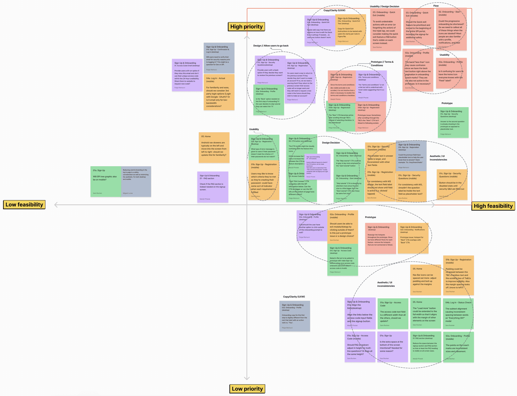
Screenshot of Prioritization Matrix for Heuristic Evaluation
Screenshot of Prioritization Matrix for Heuristic Evaluation
Screenshot of Prioritization Matrix for Heuristic Evaluation
While the heuristic evaluation did not replace the necessity for direct user feedback, it served as a valuable initial step for our team in targeting ways we could optimize the user experience of the current design prior to conducting usability tests.
While the heuristic evaluation did not replace the necessity for direct user feedback, it served as a valuable initial step for our team in targeting ways we could optimize the user experience of the current design prior to conducting usability tests.
While the heuristic evaluation did not replace the necessity for direct user feedback, it served as a valuable initial step for our team in targeting ways we could optimize the user experience of the current design prior to conducting usability tests.
Navigating Project Pivots
Reports Feature Redefined
While tackling our respective heuristic evaluations, we came together as a team to discuss the reports feature. This feature had been paused in the previous phase in order to gather more insight. As the research team planned for user interviews soon, our design team engaged in a brainstorming session where we leveraged insights from the prior phase to think about crucial user problems and needs when reporting violence, discrimination, or other incidents. This helped us craft a problem statement as well as interview questions that would validate our assumptions and uncover additional user needs for reporting.
While tackling our respective heuristic evaluations, we came together as a team to discuss the reports feature. This feature had been paused in the previous phase in order to gather more insight. As the research team planned for user interviews soon, our design team engaged in a brainstorming session where we leveraged insights from the prior phase to think about crucial user problems and needs when reporting violence, discrimination, or other incidents. This helped us craft a problem statement as well as interview questions that would validate our assumptions and uncover additional user needs for reporting.
While tackling our respective heuristic evaluations, we came together as a team to discuss the reports feature. This feature had been paused in the previous phase in order to gather more insight. As the research team planned for user interviews soon, our design team engaged in a brainstorming session where we leveraged insights from the prior phase to think about crucial user problems and needs when reporting violence, discrimination, or other incidents. This helped us craft a problem statement as well as interview questions that would validate our assumptions and uncover additional user needs for reporting.
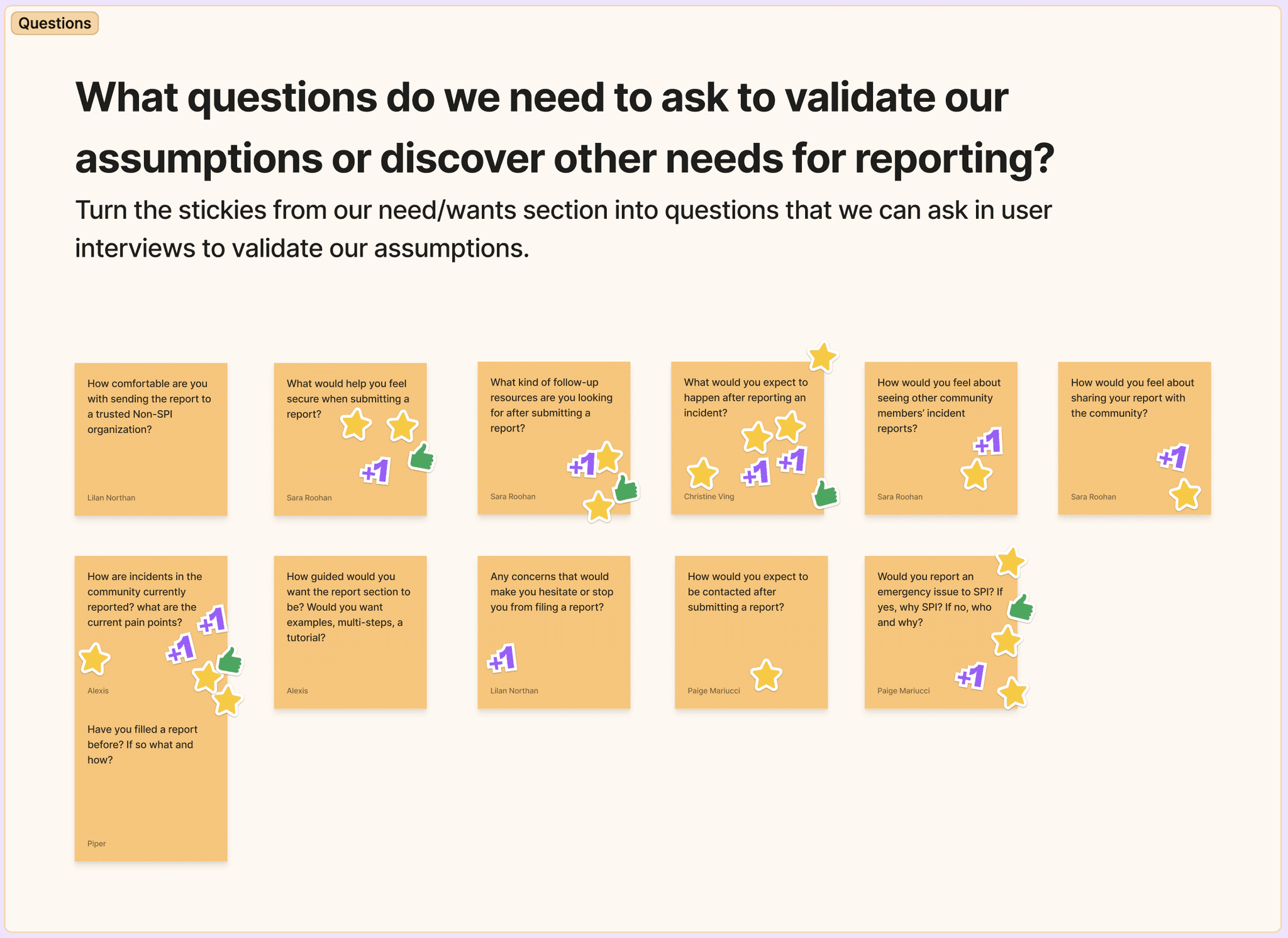
Screenshot of Brainstorm for User Interview Questions
Screenshot of Brainstorm for User Interview Questions
Screenshot of Brainstorm for User Interview Questions
We entered the first client meeting excited to share our progress and next steps where we encountered an unexpected project pivot. SPI shared that they currently lacked the resources and liability for a responsive reports feature. Instead, they envisioned it as a tool to gather incident data for human rights organizations, aiming to pressure governments into action. Consequently, users wouldn’t receive immediate resolutions for reported incidents. After thoughtful discussion, our project strategy team moved this feature out of our scope and we focused on iterating the current design while awaiting client feedback on another priority feature to develop.
We entered the first client meeting excited to share our progress and next steps where we encountered an unexpected project pivot. SPI shared that they currently lacked the resources and liability for a responsive reports feature. Instead, they envisioned it as a tool to gather incident data for human rights organizations, aiming to pressure governments into action. Consequently, users wouldn’t receive immediate resolutions for reported incidents. After thoughtful discussion, our project strategy team moved this feature out of our scope and we focused on iterating the current design while awaiting client feedback on another priority feature to develop.
We entered the first client meeting excited to share our progress and next steps where we encountered an unexpected project pivot. SPI shared that they currently lacked the resources and liability for a responsive reports feature. Instead, they envisioned it as a tool to gather incident data for human rights organizations, aiming to pressure governments into action. Consequently, users wouldn’t receive immediate resolutions for reported incidents. After thoughtful discussion, our project strategy team moved this feature out of our scope and we focused on iterating the current design while awaiting client feedback on another priority feature to develop.
FYI, the alternate feature our team focused on was TDA Connect Groups! Check out this case study for the journey of crafting the create new group feature.
FYI, the alternate feature our team focused on was TDA Connect Groups! Check out this case study for the journey of crafting the create new group feature.
FYI, the alternate feature our team focused on was TDA Connect Groups! Check out this case study for the journey of crafting the create new group feature.
This process of studying user insights for the reporting feature not only honed our UX strategy, but also emphasized the value of being responsive to the client’s needs. In true agile spirit, we recalibrated our product roadmap per this informative update.
This process of studying user insights for the reporting feature not only honed our UX strategy, but also emphasized the value of being responsive to the client’s needs. In true agile spirit, we recalibrated our product roadmap per this informative update.
This process of studying user insights for the reporting feature not only honed our UX strategy, but also emphasized the value of being responsive to the client’s needs. In true agile spirit, we recalibrated our product roadmap per this informative update.
Transform Challenges into Opportunities
A UX Design Sprint
With the reporting feature on hold, we started a team design sprint geared towards enhancing the prototype per the heuristic evaluation findings. Examining each flow, we concentrated on the needs of our user while pinpointing essential areas for improvement. A few of the exercises conducted during the design sprint included:
With the reporting feature on hold, we started a team design sprint geared towards enhancing the prototype per the heuristic evaluation findings. Examining each flow, we concentrated on the needs of our user while pinpointing essential areas for improvement. A few of the exercises conducted during the design sprint included:
With the reporting feature on hold, we started a team design sprint geared towards enhancing the prototype per the heuristic evaluation findings. Examining each flow, we concentrated on the needs of our user while pinpointing essential areas for improvement. A few of the exercises conducted during the design sprint included:
DESIGN SPRINT FOCUS | Saved Drafts feature
DESIGN SPRINT FOCUS | Saved Drafts feature
DESIGN SPRINT FOCUS | Saved Drafts feature
One of the key challenges faced by our users is low bandwidth and data limitations. Thus, we acknowledged the importance of enabling users to save and manage posts that couldn't be added to their feed due to connection issues. To transform this challenge into an opportunity, we generated "How Might We" statements for how to refine the saved drafts feature followed by a rapid sketching exercise to explore quick ideations.
One of the key challenges faced by our users is low bandwidth and data limitations. Thus, we acknowledged the importance of enabling users to save and manage posts that couldn't be added to their feed due to connection issues. To transform this challenge into an opportunity, we generated "How Might We" statements for how to refine the saved drafts feature followed by a rapid sketching exercise to explore quick ideations.
One of the key challenges faced by our users is low bandwidth and data limitations. Thus, we acknowledged the importance of enabling users to save and manage posts that couldn't be added to their feed due to connection issues. To transform this challenge into an opportunity, we generated "How Might We" statements for how to refine the saved drafts feature followed by a rapid sketching exercise to explore quick ideations.
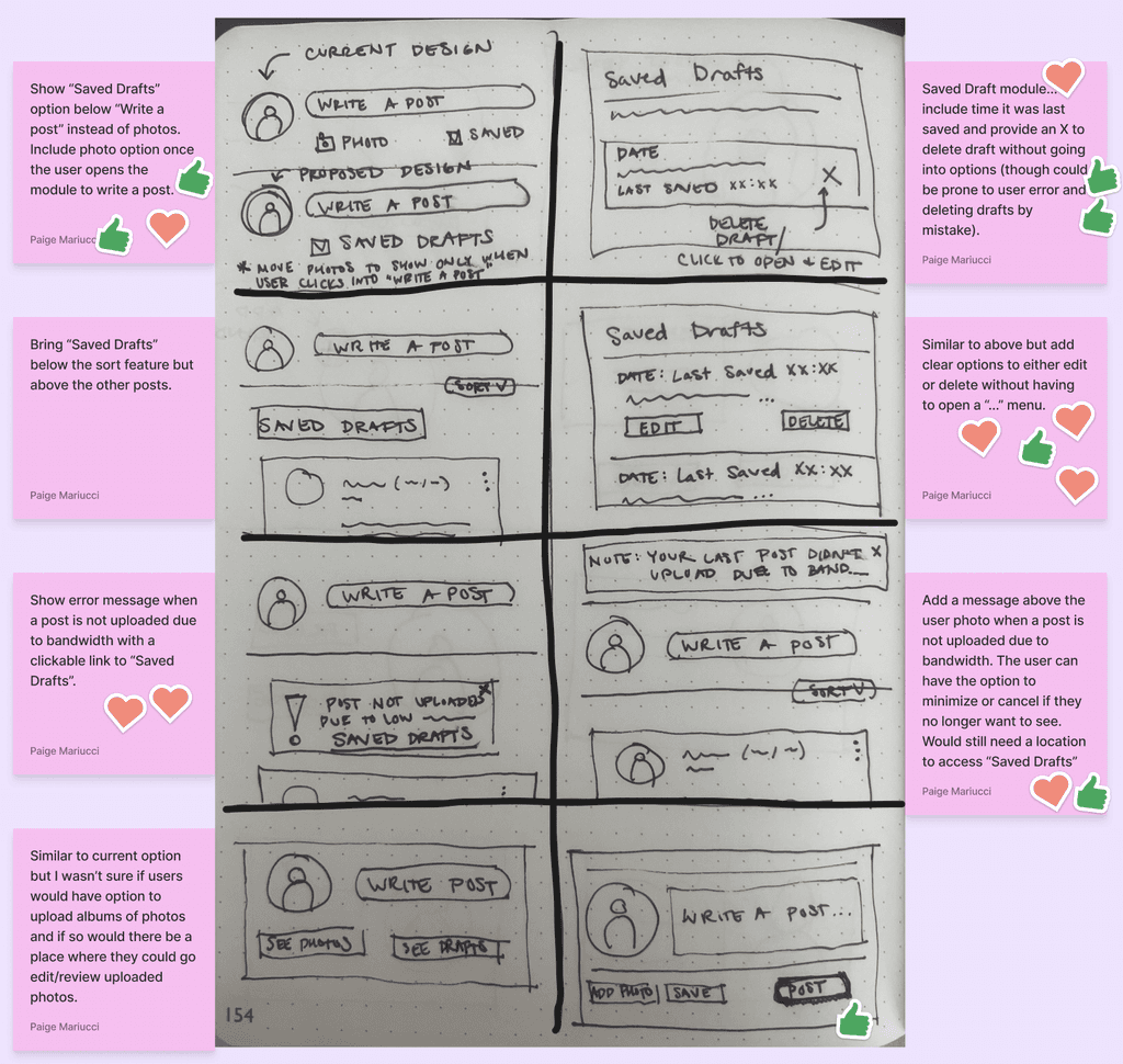
Screenshot of Crazy 8's Sketches
Screenshot of Crazy 8's Sketches
Screenshot of Crazy 8's Sketches
DESIGN SPRINT FOCUS | Quick Exit feature
DESIGN SPRINT FOCUS | Quick Exit feature
DESIGN SPRINT FOCUS | Quick Exit feature
We also reviewed the user flow from the previous phase to identify opportunities for streamlining or rearranging steps to enhance overall user experience. One of the project's primary goals is to create a safe and secure portal, evident in the "Quick Exit" feature on TDA Connect. This feature is introduced in onboarding, where users are prompted to try it. However, previous phase usability tests revealed user confusion. Valuing clarity and user comfort, we explored options such as shifting the quick exit test to the start of onboarding or pointing out the feature in onboarding while relocating the test to the settings page.
We also reviewed the user flow from the previous phase to identify opportunities for streamlining or rearranging steps to enhance overall user experience. One of the project's primary goals is to create a safe and secure portal, evident in the "Quick Exit" feature on TDA Connect. This feature is introduced in onboarding, where users are prompted to try it. However, previous phase usability tests revealed user confusion. Valuing clarity and user comfort, we explored options such as shifting the quick exit test to the start of onboarding or pointing out the feature in onboarding while relocating the test to the settings page.
We also reviewed the user flow from the previous phase to identify opportunities for streamlining or rearranging steps to enhance overall user experience. One of the project's primary goals is to create a safe and secure portal, evident in the "Quick Exit" feature on TDA Connect. This feature is introduced in onboarding, where users are prompted to try it. However, previous phase usability tests revealed user confusion. Valuing clarity and user comfort, we explored options such as shifting the quick exit test to the start of onboarding or pointing out the feature in onboarding while relocating the test to the settings page.
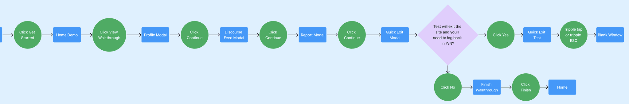
Phase 1: Onboarding User Flow
Phase 1: Onboarding User Flow
Phase 1: Onboarding User Flow
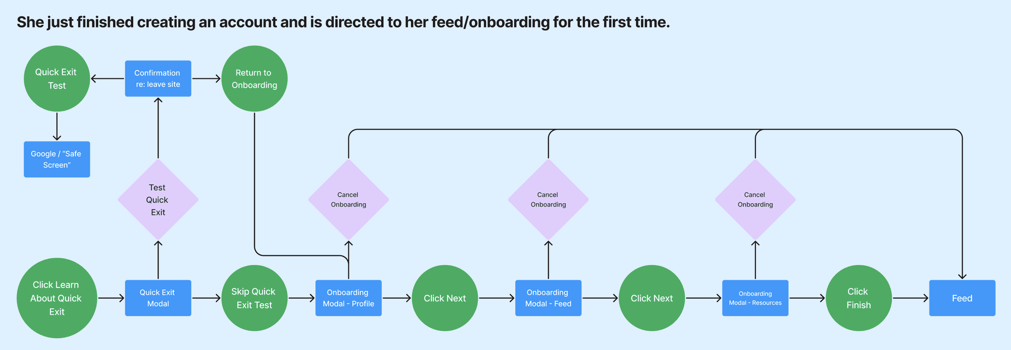
Revised: Onboarding User Flow
Revised: Onboarding User Flow
Revised: Onboarding User Flow
Enhancing User Clarity
High-Fidelity Wireframes, Content, & Sitemap
During the transition from mid-fidelity to high-fidelity wireframes, we collaborated closely with the UX writing team to ensure a consistent and cohesive design by updating the copy to align with the content style guide. Below are some modifications to the signup screen per the content audit:
During the transition from mid-fidelity to high-fidelity wireframes, we collaborated closely with the UX writing team to ensure a consistent and cohesive design by updating the copy to align with the content style guide. Below are some modifications to the signup screen per the content audit:
During the transition from mid-fidelity to high-fidelity wireframes, we collaborated closely with the UX writing team to ensure a consistent and cohesive design by updating the copy to align with the content style guide. Below are some modifications to the signup screen per the content audit:
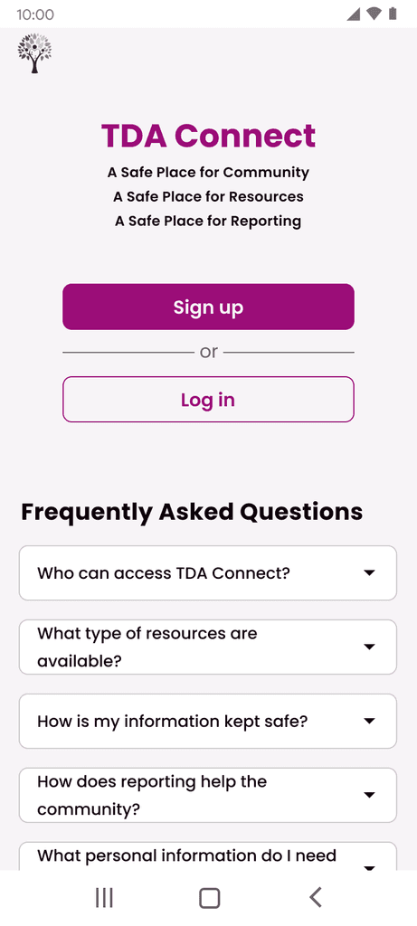
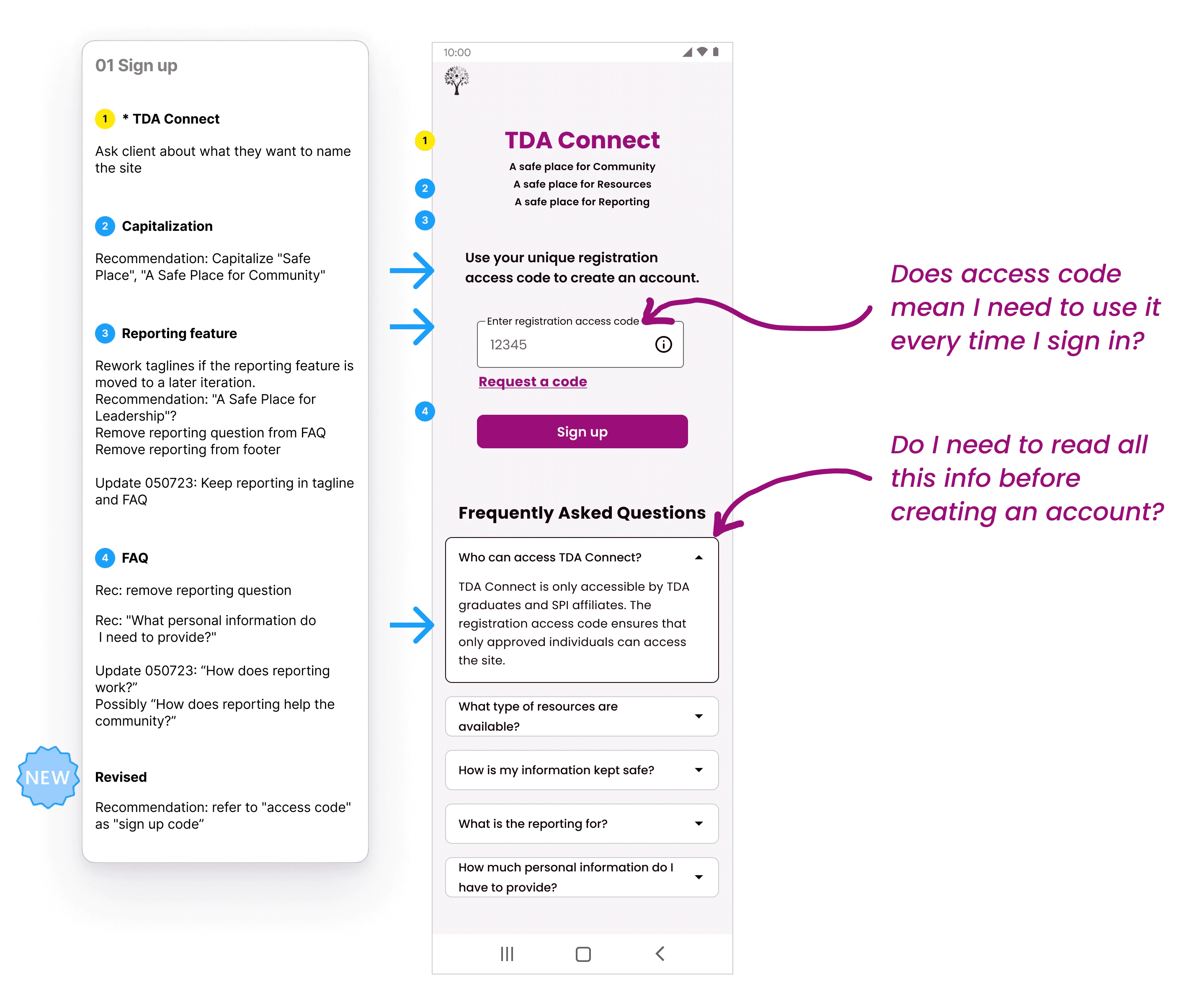
Based on insights from the previous phase's usability tests, we knew there was user confusion surrounding the purpose of the access code and overwhelming presence of FAQ’s on the signup screen. To tackle these issues, I partnered with my content counterpart to enhance clarity. We replaced "registration access code" with "sign up code" for better understanding and reduced cognitive load by relocating the FAQ’s to a separate page. These adjustments were aimed at providing users with a smoother and more intuitive signup experience.
Based on insights from the previous phase's usability tests, we knew there was user confusion surrounding the purpose of the access code and overwhelming presence of FAQ’s on the signup screen. To tackle these issues, I partnered with my content counterpart to enhance clarity. We replaced "registration access code" with "sign up code" for better understanding and reduced cognitive load by relocating the FAQ’s to a separate page. These adjustments were aimed at providing users with a smoother and more intuitive signup experience.
Based on insights from the previous phase's usability tests, we knew there was user confusion surrounding the purpose of the access code and overwhelming presence of FAQ’s on the signup screen. To tackle these issues, I partnered with my content counterpart to enhance clarity. We replaced "registration access code" with "sign up code" for better understanding and reduced cognitive load by relocating the FAQ’s to a separate page. These adjustments were aimed at providing users with a smoother and more intuitive signup experience.
Screenshot of Content Audit
Screenshot of Content Audit
Screenshot of Content Audit
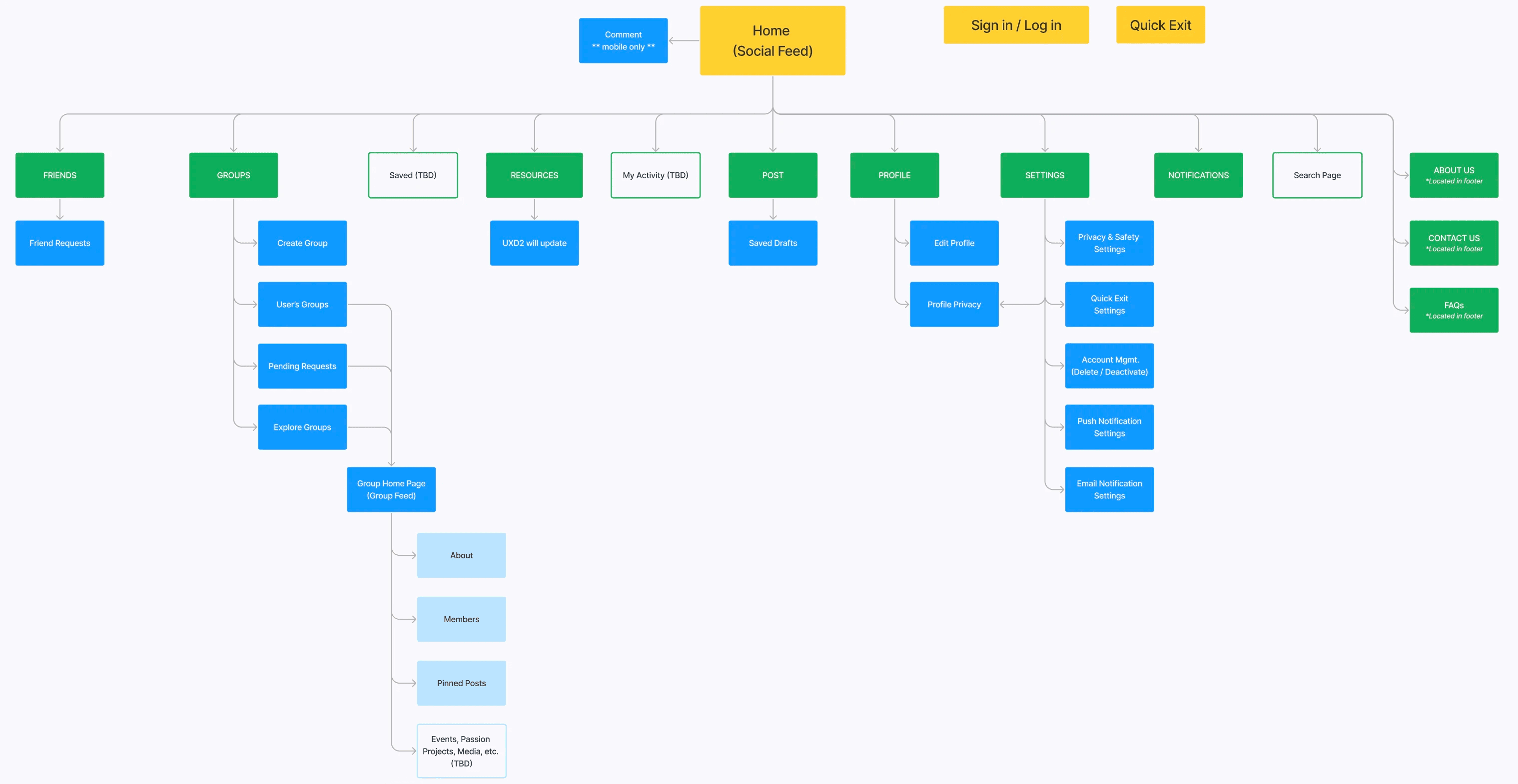
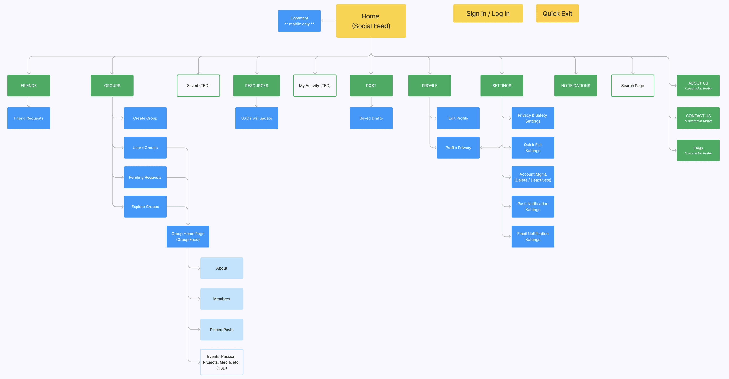
As we neared completion of our high-fidelity wireframes, we engaged in a team effort to reevaluate the overall sitemap to ensure alignment with our iterations. A notable change involved removing the signup branch from the main tree. This decision was driven by the realization that these steps represent components of a user flow rather than elements of the site's navigational hierarchy. By making this revision, we aimed to improve the organization and order of the platform.
As we neared completion of our high-fidelity wireframes, we engaged in a team effort to reevaluate the overall sitemap to ensure alignment with our iterations. A notable change involved removing the signup branch from the main tree. This decision was driven by the realization that these steps represent components of a user flow rather than elements of the site's navigational hierarchy. By making this revision, we aimed to improve the organization and order of the platform.
As we neared completion of our high-fidelity wireframes, we engaged in a team effort to reevaluate the overall sitemap to ensure alignment with our iterations. A notable change involved removing the signup branch from the main tree. This decision was driven by the realization that these steps represent components of a user flow rather than elements of the site's navigational hierarchy. By making this revision, we aimed to improve the organization and order of the platform.
Phase 1: Site Map | hover to expand

Phase 2: Site Map | hover to expand
Phase 1: Site Map | tap & drag to magnify
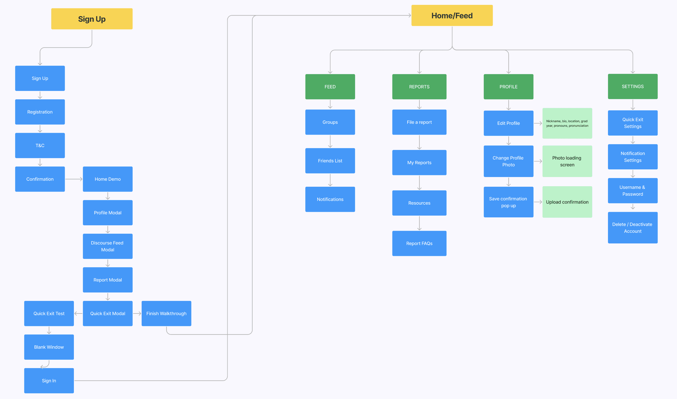
Phase 1: Site Map | tap to expand
Phase 2: Site Map | tap to expand
Phase 2: Site Map | tap & drag to magnify
After updating the wireframes and sitemap, we realized the need to review the menu and navigation design for both mobile and desktop screens to ensure a seamless and logical user experience. We brainstormed ideas as a team, then I was responsible for finalizing the desktop navigation.
After updating the wireframes and sitemap, we realized the need to review the menu and navigation design for both mobile and desktop screens to ensure a seamless and logical user experience. We brainstormed ideas as a team, then I was responsible for finalizing the desktop navigation.
After updating the wireframes and sitemap, we realized the need to review the menu and navigation design for both mobile and desktop screens to ensure a seamless and logical user experience. We brainstormed ideas as a team, then I was responsible for finalizing the desktop navigation.
MENU AND NAVIGATION UPDATE | Desktop Screens
MENU AND NAVIGATION UPDATE | Desktop Screens
MENU AND NAVIGATION UPDATE | Desktop Screens
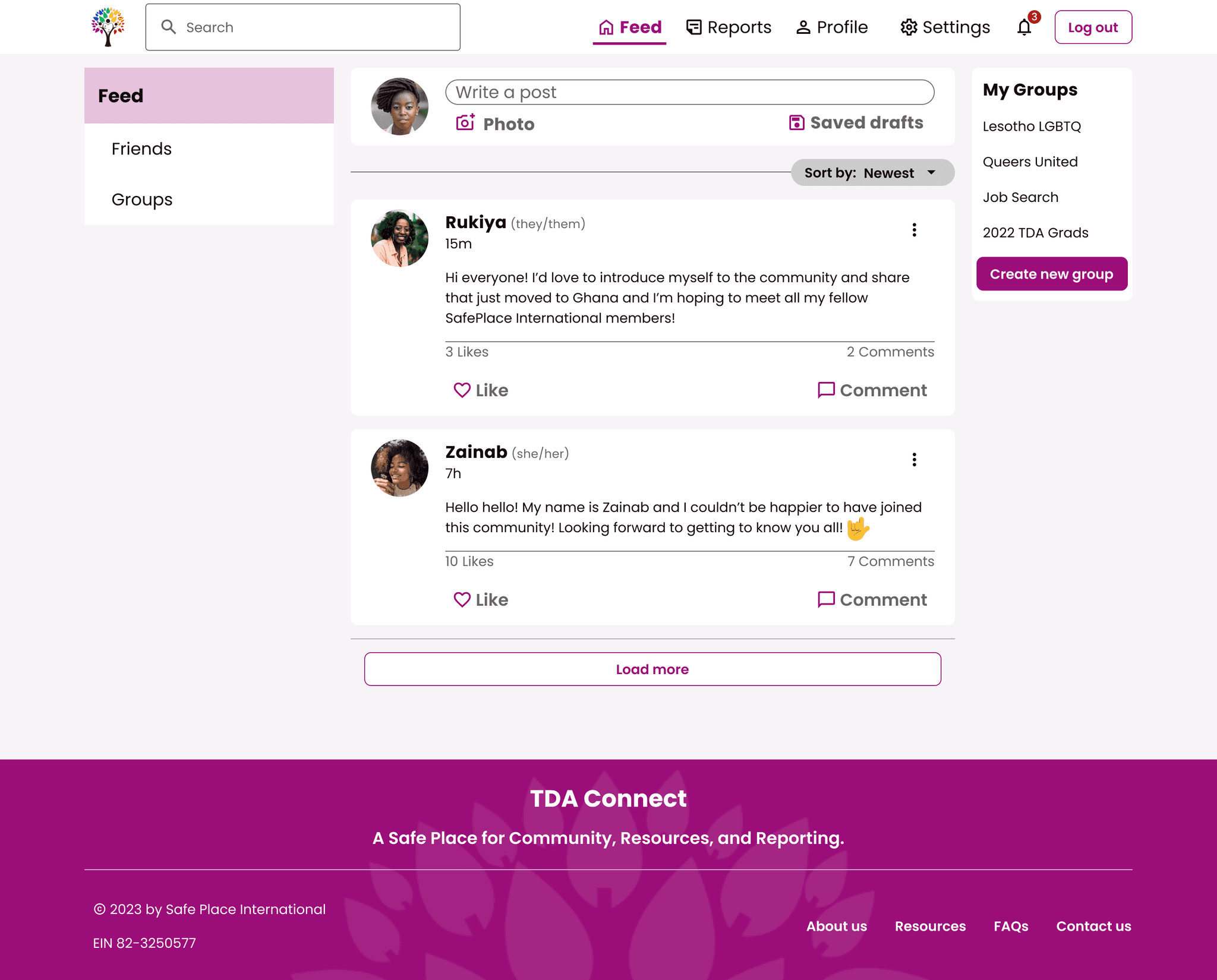
Phase 1: Home Feed & Navigation Menu
Phase 1: Home Feed & Navigation Menu
Phase 1: Home Feed & Navigation Menu
In the previous design (see above), the navigation menu options, search bar, and logout were all placed within a horizontal top rail. While functional, it was a slightly clunky solution. For the revised design (see below) I proposed a vertical rail on the left side of the screen in line with Google's Material Design principles. This offers a responsive solution for diverse devices where the menu options and search function can be collapsed into icons.
In the previous design (see above), the navigation menu options, search bar, and logout were all placed within a horizontal top rail. While functional, it was a slightly clunky solution. For the revised design (see below) I proposed a vertical rail on the left side of the screen in line with Google's Material Design principles. This offers a responsive solution for diverse devices where the menu options and search function can be collapsed into icons.
In the previous design (see above), the navigation menu options, search bar, and logout were all placed within a horizontal top rail. While functional, it was a slightly clunky solution. For the revised design (see below) I proposed a vertical rail on the left side of the screen in line with Google's Material Design principles. This offers a responsive solution for diverse devices where the menu options and search function can be collapsed into icons.
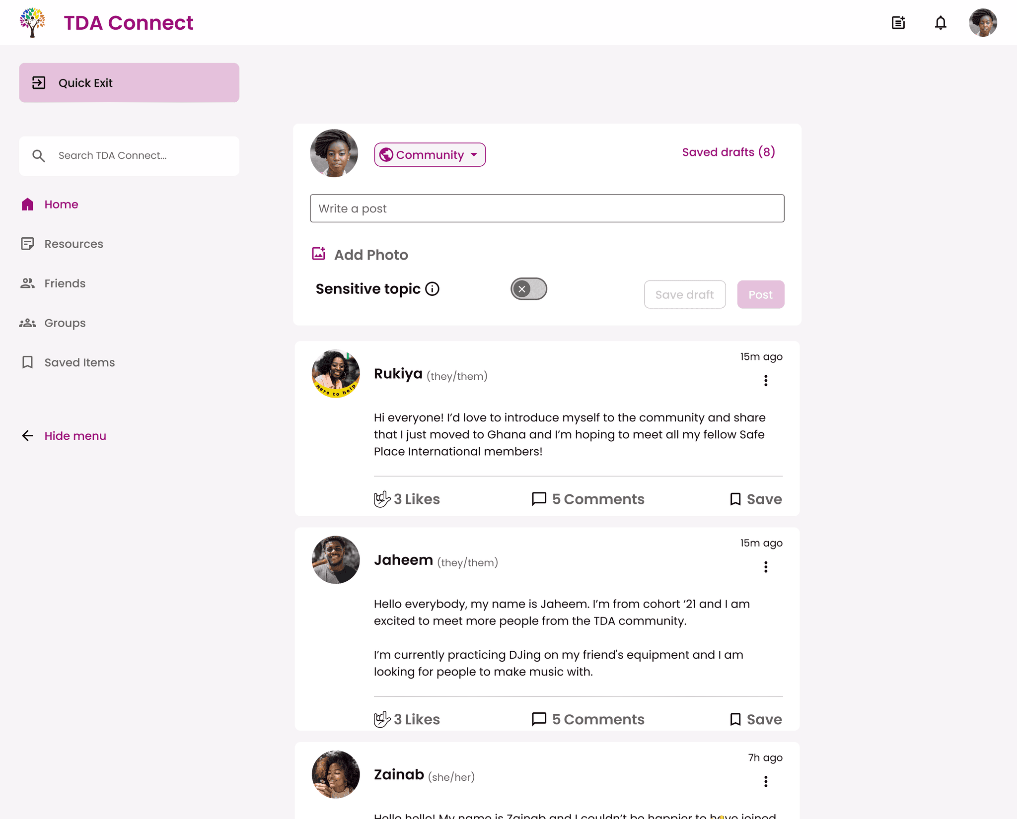
Revised: Home Feed & Navigation Menu
Revised: Home Feed & Navigation Menu
Revised: Home Feed & Navigation Menu
During the menu design update, another significant improvement was to the quick exit interaction. Previously, users had to tap their screen (or escape button on their keyboard) three times to trigger the quick exit which could be cumbersome and easily forgotten over time. To address this, we implemented a visible and accessible quick exit button that is always present on both mobile and desktop screens. This change ensures that users can easily utilize the feature whenever needed, enhancing their sense of safety and security on TDA Connect (see below).
During the menu design update, another significant improvement was to the quick exit interaction. Previously, users had to tap their screen (or escape button on their keyboard) three times to trigger the quick exit which could be cumbersome and easily forgotten over time. To address this, we implemented a visible and accessible quick exit button that is always present on both mobile and desktop screens. This change ensures that users can easily utilize the feature whenever needed, enhancing their sense of safety and security on TDA Connect (see below).
During the menu design update, another significant improvement was to the quick exit interaction. Previously, users had to tap their screen (or escape button on their keyboard) three times to trigger the quick exit which could be cumbersome and easily forgotten over time. To address this, we implemented a visible and accessible quick exit button that is always present on both mobile and desktop screens. This change ensures that users can easily utilize the feature whenever needed, enhancing their sense of safety and security on TDA Connect (see below).
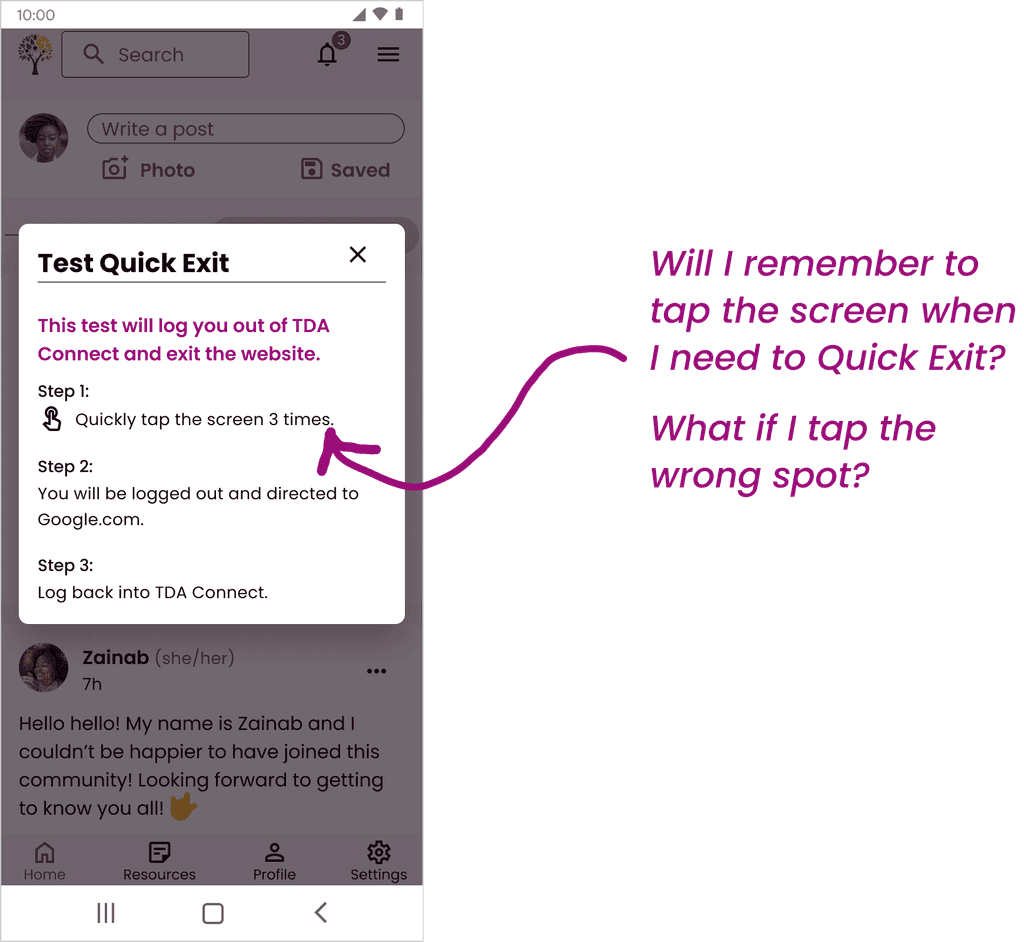
Phase 1: Quick Exit Test Instructions
Phase 1: Quick Exit Test Instructions
Phase 1: Quick Exit Test Instructions
Revised: Quick Exit Onboarding
(Mobile)
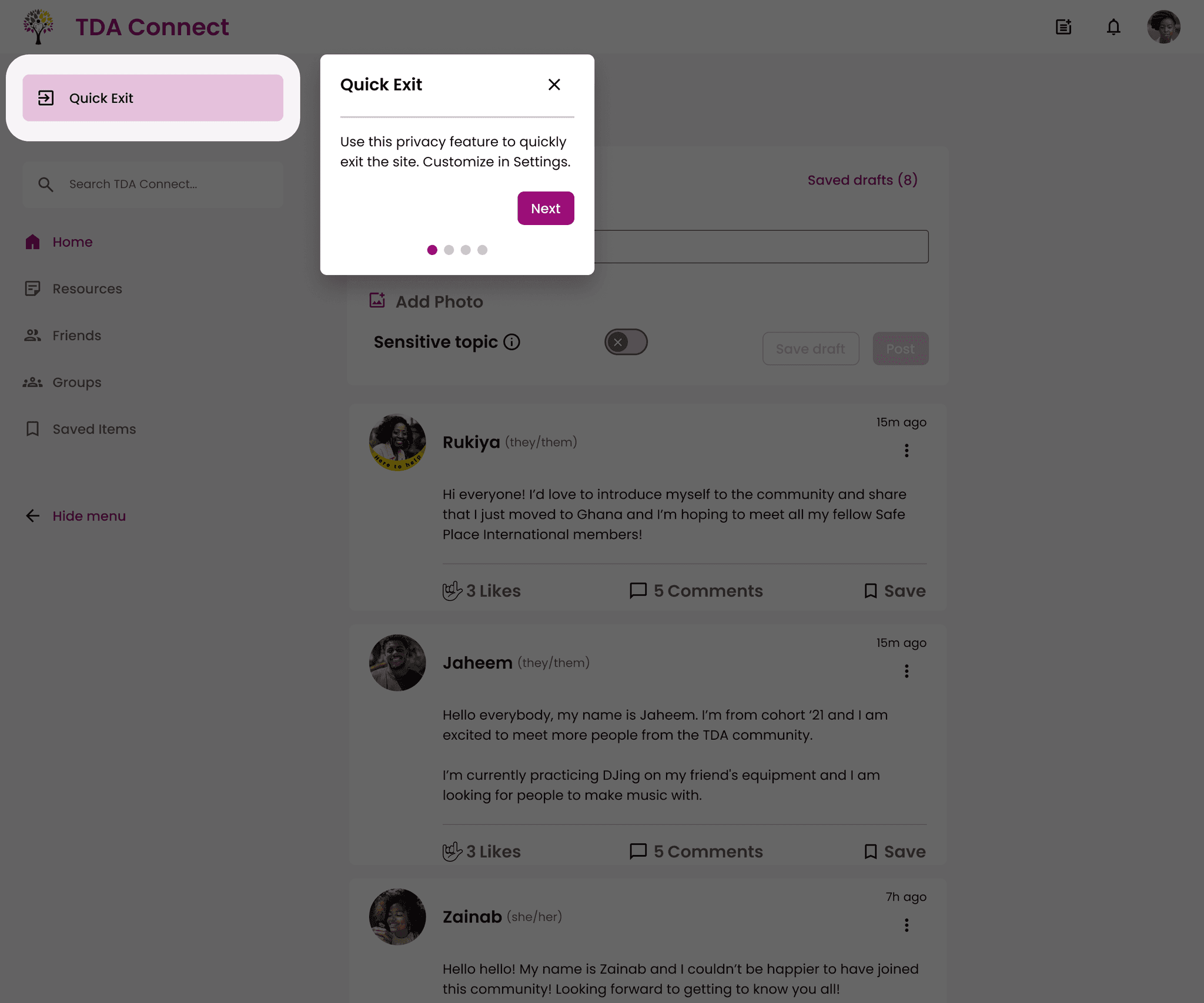
Revised: Quick Exit Onboarding
(Desktop)
Revised: Quick Exit Onboarding
(Mobile)
Revised: Quick Exit Onboarding
(Desktop)
Revised: Quick Exit Onboarding
(Mobile)
Revised: Quick Exit Onboarding
(Desktop)
Power of Cross-Team Collaboration
Building a Foundation for TDA Connect
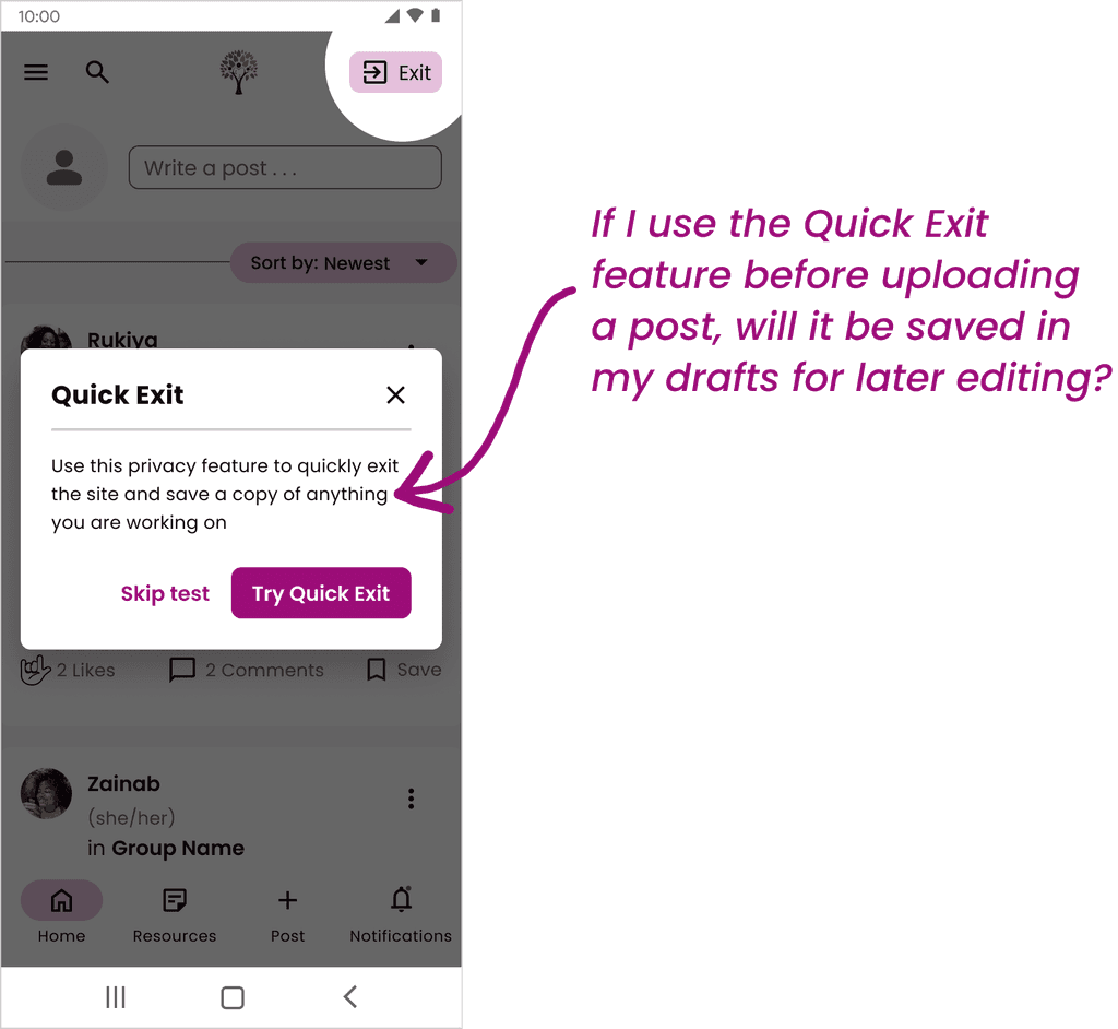
We were fortunate this phase to have a dedicated development team building the foundation for TDA Connect. During our iterations, we arranged a feasibility walkthrough of our prototype with the back-end developers to ensure the design was practical to implement. This collaborative session allowed us to communicate design decisions, such as the transition away from the 3-tap quick exit interaction, as well as seek clarifications on technical aspects, like the differences between a user logging out or quick exiting.
We were fortunate this phase to have a dedicated development team building the foundation for TDA Connect. During our iterations, we arranged a feasibility walkthrough of our prototype with the back-end developers to ensure the design was practical to implement. This collaborative session allowed us to communicate design decisions, such as the transition away from the 3-tap quick exit interaction, as well as seek clarifications on technical aspects, like the differences between a user logging out or quick exiting.
We were fortunate this phase to have a dedicated development team building the foundation for TDA Connect. During our iterations, we arranged a feasibility walkthrough of our prototype with the back-end developers to ensure the design was practical to implement. This collaborative session allowed us to communicate design decisions, such as the transition away from the 3-tap quick exit interaction, as well as seek clarifications on technical aspects, like the differences between a user logging out or quick exiting.
As a result of this partnership, we revised the quick exit onboarding prompt by removing the misleading mention that a copy of anything the user was working on immediately before quick exiting would be saved as that was not feasible. We learned from the development team that the quick exit protocol clears session data, such as cookies and local storage, associated with the user's session. Establishing this alignment between design and development helped to ensure a smooth and buildable product for TDA Connect going forward.
As a result of this partnership, we revised the quick exit onboarding prompt by removing the misleading mention that a copy of anything the user was working on immediately before quick exiting would be saved as that was not feasible. We learned from the development team that the quick exit protocol clears session data, such as cookies and local storage, associated with the user's session. Establishing this alignment between design and development helped to ensure a smooth and buildable product for TDA Connect going forward.
As a result of this partnership, we revised the quick exit onboarding prompt by removing the misleading mention that a copy of anything the user was working on immediately before quick exiting would be saved as that was not feasible. We learned from the development team that the quick exit protocol clears session data, such as cookies and local storage, associated with the user's session. Establishing this alignment between design and development helped to ensure a smooth and buildable product for TDA Connect going forward.
Phase 1: Test Quick Exit
Phase 1: Test Quick Exit
Phase 1: Test Quick Exit
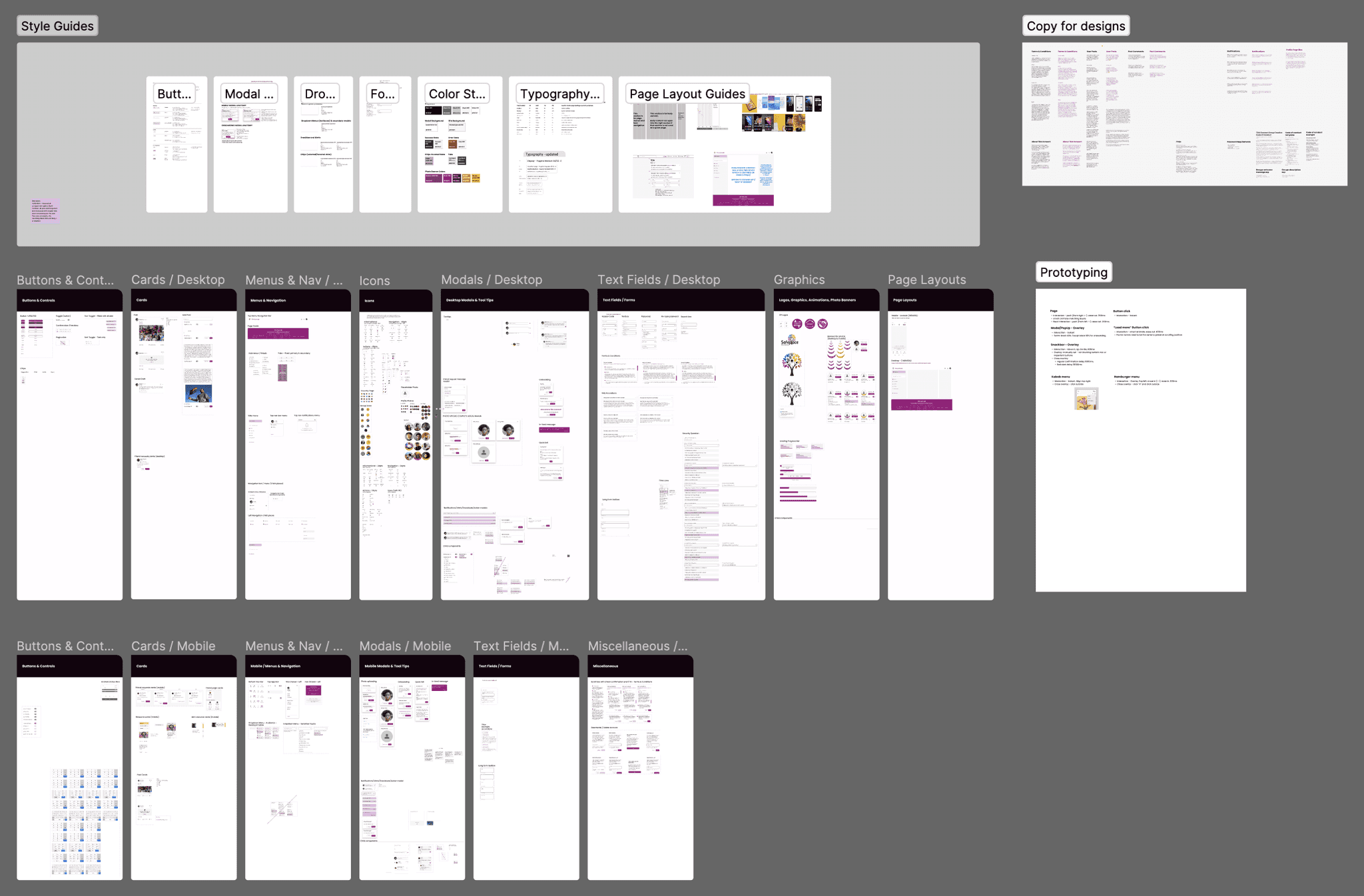
An essential aspect for handoff to the front-end development team involved cleaning up the existing design system. Streamlining the design system allows for a faster and more efficient design process and a well-organized design system would greatly benefit later project phases. However, maintaining the design system posed its challenges, as each team member had to meticulously update or retire components as needed. I learned that managing the design system alongside other design tasks was a considerable effort; it could have easily warranted a dedicated team.
If you want to check out our entire design system use this link: SPI Phase 2 Design System
Screenshot of Overall Design System
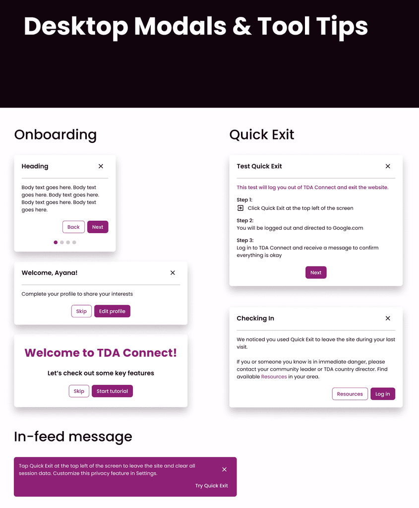
Screenshot of Modals from Design System
Screenshot of Overall Design System
Screenshot of Modals from Design System
Screenshot of Overall Design System
Screenshot of Modals from Design System
To complement the design system, our team implemented a UI checklist managed on our team kanban board. This tool served as a reliable way to track individual responsibilities and ensure alignment with the latest design standards.
To complement the design system, our team implemented a UI checklist managed on our team kanban board. This tool served as a reliable way to track individual responsibilities and ensure alignment with the latest design standards.
To complement the design system, our team implemented a UI checklist managed on our team kanban board. This tool served as a reliable way to track individual responsibilities and ensure alignment with the latest design standards.
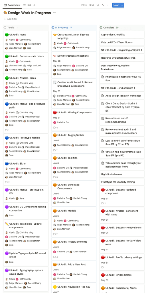
Screenshot of Team Kanban Board
Screenshot of Team Kanban Board
Screenshot of Team Kanban Board
Given that we worked asynchronously and had two design teams simultaneously working on this phase, the necessity for a design system and consistent UI standards became evident. We also recognized the value of a shared language and standardized approach as it allowed us to concentrate our design work on solving user problems.
Given that we worked asynchronously and had two design teams simultaneously working on this phase, the necessity for a design system and consistent UI standards became evident. We also recognized the value of a shared language and standardized approach as it allowed us to concentrate our design work on solving user problems.
Given that we worked asynchronously and had two design teams simultaneously working on this phase, the necessity for a design system and consistent UI standards became evident. We also recognized the value of a shared language and standardized approach as it allowed us to concentrate our design work on solving user problems.
Lessons from Usability Testing
Minimizing User Fatigue
At long last, the moment we had eagerly awaited since the project's inception had arrived - the handoff of our prototype to the research team for conducting usability tests with TDA graduates! To ensure a successful test, we collaborated with the research team by walking them through the prototype and helping them to prepare a practical test plan.
At long last, the moment we had eagerly awaited since the project's inception had arrived - the handoff of our prototype to the research team for conducting usability tests with TDA graduates! To ensure a successful test, we collaborated with the research team by walking them through the prototype and helping them to prepare a practical test plan.
At long last, the moment we had eagerly awaited since the project's inception had arrived - the handoff of our prototype to the research team for conducting usability tests with TDA graduates! To ensure a successful test, we collaborated with the research team by walking them through the prototype and helping them to prepare a practical test plan.
Our primary aim was to uncover the goals and challenges faced by our target users when interacting with the proposed mobile interface. Though we had developed the desktop screens as well, we chose to focus on testing the mobile prototype considering that the majority of users would access TDA Connect through a phone. The signup and onboarding task presented to participants was as follows:
Our primary aim was to uncover the goals and challenges faced by our target users when interacting with the proposed mobile interface. Though we had developed the desktop screens as well, we chose to focus on testing the mobile prototype considering that the majority of users would access TDA Connect through a phone. The signup and onboarding task presented to participants was as follows:
Our primary aim was to uncover the goals and challenges faced by our target users when interacting with the proposed mobile interface. Though we had developed the desktop screens as well, we chose to focus on testing the mobile prototype considering that the majority of users would access TDA Connect through a phone. The signup and onboarding task presented to participants was as follows:
You've just graduated from The Dream Academy and received your login code for TDA Connect on WhatsApp. How would you go about signing up for the platform?
You've just graduated from The Dream Academy and received your login code for TDA Connect on WhatsApp. How would you go about signing up for the platform?
You've just graduated from The Dream Academy and received your login code for TDA Connect on WhatsApp. How would you go about signing up for the platform?
The goal was to observe participant’s experience with the sign up code, assess the enjoyment of the shortened onboarding flow, as well as examine their understanding of the quick exit feature and whether they chose to test the quick exit.
The goal was to observe participant’s experience with the sign up code, assess the enjoyment of the shortened onboarding flow, as well as examine their understanding of the quick exit feature and whether they chose to test the quick exit.
The goal was to observe participant’s experience with the sign up code, assess the enjoyment of the shortened onboarding flow, as well as examine their understanding of the quick exit feature and whether they chose to test the quick exit.
During the usability tests, our design team was able to attend as notetakers which provided us with early insights into user interactions with the refined prototype. Witnessing users engage with our designs after weeks of work was exciting. However, it confirmed that low bandwidth posed a significant challenge for our users causing the cancellation or rescheduling of a handful of tests due to connection issues.
During the usability tests, our design team was able to attend as notetakers which provided us with early insights into user interactions with the refined prototype. Witnessing users engage with our designs after weeks of work was exciting. However, it confirmed that low bandwidth posed a significant challenge for our users causing the cancellation or rescheduling of a handful of tests due to connection issues.
During the usability tests, our design team was able to attend as notetakers which provided us with early insights into user interactions with the refined prototype. Witnessing users engage with our designs after weeks of work was exciting. However, it confirmed that low bandwidth posed a significant challenge for our users causing the cancellation or rescheduling of a handful of tests due to connection issues.
After conducting tests with six participants, the research team prioritized the issues uncovered and among them a critical concern emerged:
After conducting tests with six participants, the research team prioritized the issues uncovered and among them a critical concern emerged:
After conducting tests with six participants, the research team prioritized the issues uncovered and among them a critical concern emerged:
Overall user fatigue during the signup and onboarding process.
Overall user fatigue during the signup and onboarding process.
Overall user fatigue during the signup and onboarding process.
Despite having reduced the onboarding steps, users were still being asked to go through a multi-step registration flow, review the onboarding sequence, and read about the quick exit feature before deciding whether to test it. Interestingly, many participants admitted to typically skipping onboarding flows and 66% did not carefully read the guided tutorials.
Despite having reduced the onboarding steps, users were still being asked to go through a multi-step registration flow, review the onboarding sequence, and read about the quick exit feature before deciding whether to test it. Interestingly, many participants admitted to typically skipping onboarding flows and 66% did not carefully read the guided tutorials.
Despite having reduced the onboarding steps, users were still being asked to go through a multi-step registration flow, review the onboarding sequence, and read about the quick exit feature before deciding whether to test it. Interestingly, many participants admitted to typically skipping onboarding flows and 66% did not carefully read the guided tutorials.
These findings highlighted the need for further improvements to the user onboarding experience. In response to these issues we made the below revisions:
These findings highlighted the need for further improvements to the user onboarding experience. In response to these issues we made the below revisions:
These findings highlighted the need for further improvements to the user onboarding experience. In response to these issues we made the below revisions:
Revised: Registration Flow
Revised: Registration Flow
Revised: Registration Flow
DESIGN UPDATE | Google OAuth Signup
DESIGN UPDATE | Google OAuth Signup
DESIGN UPDATE | Google OAuth Signup
We collaborated with the development team to explore the feasibility of implementing a Google OAuth signup process which would simplify the experience by allowing users to easily register with their Google accounts instead of having to provide information, enter a password, and answer security questions. This approach seemed promising given that TDA graduates create Google email accounts as part of their coursework with SPI. Streamlining the signup process allowed us to retain user’s attention for the onboarding sequence.
We collaborated with the development team to explore the feasibility of implementing a Google OAuth signup process which would simplify the experience by allowing users to easily register with their Google accounts instead of having to provide information, enter a password, and answer security questions. This approach seemed promising given that TDA graduates create Google email accounts as part of their coursework with SPI. Streamlining the signup process allowed us to retain user’s attention for the onboarding sequence.
We collaborated with the development team to explore the feasibility of implementing a Google OAuth signup process which would simplify the experience by allowing users to easily register with their Google accounts instead of having to provide information, enter a password, and answer security questions. This approach seemed promising given that TDA graduates create Google email accounts as part of their coursework with SPI. Streamlining the signup process allowed us to retain user’s attention for the onboarding sequence.
DESIGN UPDATE | Quick Exit Test
DESIGN UPDATE | Quick Exit Test
DESIGN UPDATE | Quick Exit Test
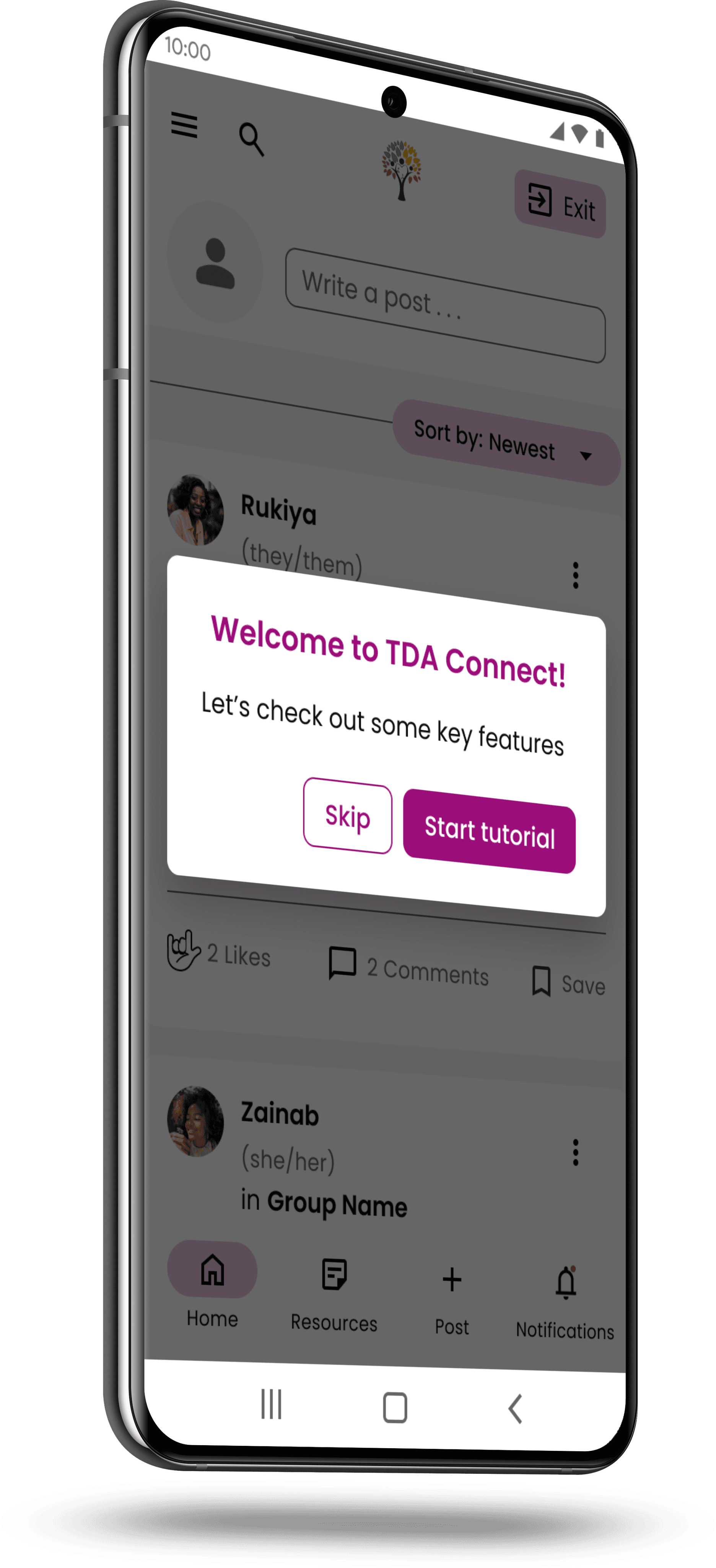
Instead of including the quick exit test in the onboarding flow, the decision was made to present it as a separate pop-up on the user's feed. The intent being that the message would remain in their feed until the user chooses to "Try Quick Exit" or close it intentionally. While the quick exit would still be highlighted during onboarding for visibility, removing the test from the flow would give users the freedom to explore it at their convenience.
Instead of including the quick exit test in the onboarding flow, the decision was made to present it as a separate pop-up on the user's feed. The intent being that the message would remain in their feed until the user chooses to "Try Quick Exit" or close it intentionally. While the quick exit would still be highlighted during onboarding for visibility, removing the test from the flow would give users the freedom to explore it at their convenience.
Instead of including the quick exit test in the onboarding flow, the decision was made to present it as a separate pop-up on the user's feed. The intent being that the message would remain in their feed until the user chooses to "Try Quick Exit" or close it intentionally. While the quick exit would still be highlighted during onboarding for visibility, removing the test from the flow would give users the freedom to explore it at their convenience.
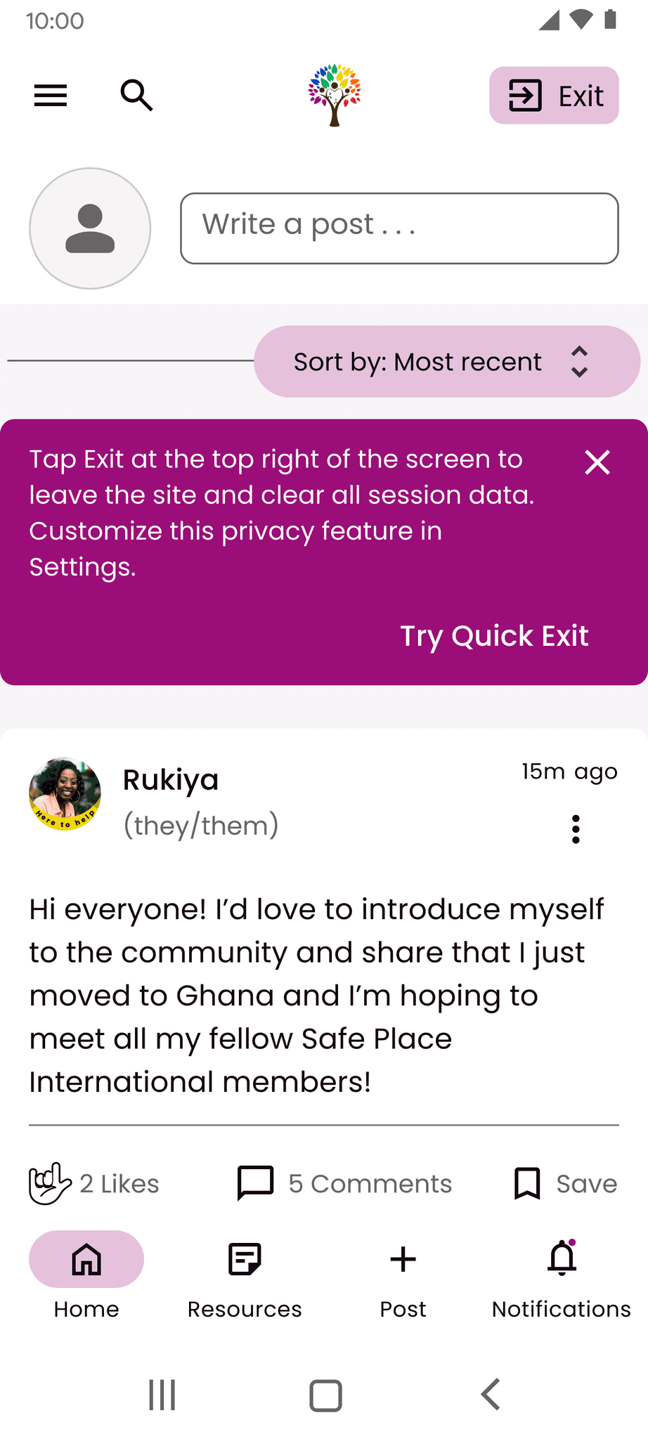
Revised: Feed with Quick Exit Test
(Mobile)
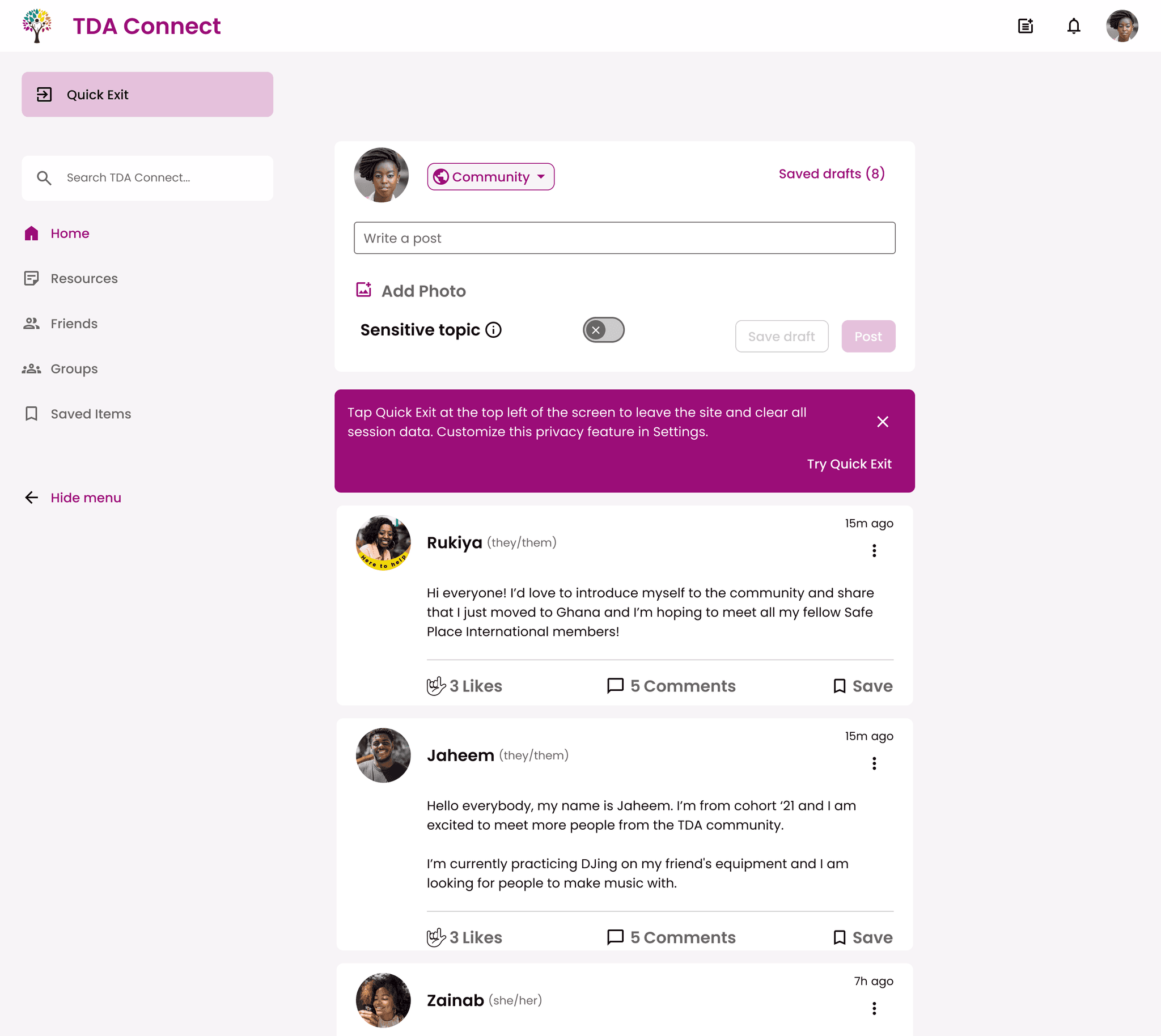
Revised: Feed with Quick Exit Test
(Desktop)
Revised: Feed with Quick Exit Test
(Mobile)
Revised: Feed with Quick Exit Test
(Desktop)
Revised: Feed with Quick Exit Test
(Mobile)
Revised: Feed with Quick Exit Test
(Desktop)
IMPACT | Our UX design team's endeavor to enhance the user experience of TDA Connect led to a significant impact and notable improvements to the platform. Through heuristic evaluations and usability tests, we were able to reevaluate the quick exit feature as well as streamline the signup and onboarding process to deliver a more enjoyable user experience when engaging with TDA Connect. The design of the navigational menu was updated for both mobile and desktop. Additionally, the team's efforts in strengthening the design system and conducting feasibility walkthroughs with the development team established a robust foundation for future project phases.
IMPACT | Our UX design team's endeavor to enhance the user experience of TDA Connect led to a significant impact and notable improvements to the platform. Through heuristic evaluations and usability tests, we were able to reevaluate the quick exit feature as well as streamline the signup and onboarding process to deliver a more enjoyable user experience when engaging with TDA Connect. The design of the navigational menu was updated for both mobile and desktop. Additionally, the team's efforts in strengthening the design system and conducting feasibility walkthroughs with the development team established a robust foundation for future project phases.
IMPACT | Our UX design team's endeavor to enhance the user experience of TDA Connect led to a significant impact and notable improvements to the platform. Through heuristic evaluations and usability tests, we were able to reevaluate the quick exit feature as well as streamline the signup and onboarding process to deliver a more enjoyable user experience when engaging with TDA Connect. The design of the navigational menu was updated for both mobile and desktop. Additionally, the team's efforts in strengthening the design system and conducting feasibility walkthroughs with the development team established a robust foundation for future project phases.
“It was just amazing seeing everything that we’ve been talking about, put into action. It’s so magical, I just cannot describe how happy I am."
- SPI Director of Operations
“We’ve been looking for alternative gift options to devices for our TDA graduates and I can already see that this product is going to be a massive, massive gift in that way for the entire community.”
- SPI Executive Director
“I’m so happy and deeply grateful for everything that all of you have put in and are doing currently. It’s just so nice to see that this platform is gonna have such a big impact on our community.”
- SPI Director of Operations
“Thank you so much for your incredible attention and resourcing regarding security. That's a huge, huge thing. And it's becoming more and more important as things devolve in the communities that we are serving. So I really appreciate that.”
- SPI Executive Director
“Thank you for creating this platform for our graduates. I am sure that this is going to be life changing for so many people.”
- SPI Director of Operations
“I’m very excited to see how this moves forward and am incredibly grateful.”
- SPI Executive Director
NEXT STEPS | The Google OAuth signup process and in-feed quick exit test were implemented at the end of this project phase and will require validation through user testing. Ongoing usability tests with TDA graduates are crucial to continuously gather direct user feedback, address pain points, and refine the platform. It is also important to maintain collaboration with the back-end development team to explore ways of optimizing for users with low bandwidth and data constraints while ensuring user privacy and security. Additionally, annotating components in our design system will facilitate the handoff to the front-end development team enabling them to start building TDA Connect.
NEXT STEPS | The Google OAuth signup process and in-feed quick exit test were implemented at the end of this project phase and will require validation through user testing. Ongoing usability tests with TDA graduates are crucial to continuously gather direct user feedback, address pain points, and refine the platform. It is also important to maintain collaboration with the back-end development team to explore ways of optimizing for users with low bandwidth and data constraints while ensuring user privacy and security. Additionally, annotating components in our design system will facilitate the handoff to the front-end development team enabling them to start building TDA Connect.
NEXT STEPS | The Google OAuth signup process and in-feed quick exit test were implemented at the end of this project phase and will require validation through user testing. Ongoing usability tests with TDA graduates are crucial to continuously gather direct user feedback, address pain points, and refine the platform. It is also important to maintain collaboration with the back-end development team to explore ways of optimizing for users with low bandwidth and data constraints while ensuring user privacy and security. Additionally, annotating components in our design system will facilitate the handoff to the front-end development team enabling them to start building TDA Connect.
Revised: Signup and Onboarding Flow
Revised: Signup and Onboarding Flow
Revised: Signup and Onboarding Flow
TDA CONNECT
TDA CONNECT
TDA CONNECT
TAKEAWAYS | This project was incredibly fulfilling for me. Both the positive feedback from the client and the satisfaction of users during testing were truly rewarding experiences. I acquired a greater understanding of designing with sensitivity for users dealing with low bandwidth or privacy concerns. Further, collaborating with a cross-functional team allowed me to learn and grow as a designer, and I appreciated the opportunity to challenge previous solutions and incorporate direct user insights into our design process. Despite primarily iterating on an existing design, I still had plenty to work on during this phase and our team implemented numerous improvements to five essential user flows on TDA Connect. While the reports feature was excluded from our scope at the start of the project, I observed how adaptation ultimately enabled us to channel our efforts towards enhancing the MVP and advancing the design.
Ready for more? Take a peek at our design sprint where we explored how users go about forming a new group on TDA Connect: Check out the Case Study Here!